
Barracuda — Email Protection Setup
Increasing the completion rate for a product bundle setup by 34%
Barracuda Email Protection is a comprehensive suite of cloud services designed to safeguard organizations against email threat. The suite consists of products, each specializing in features like gateway security, data protection, and AI-driven threat protection.
The suite consists of 3 core products, which are marketed and sold as a bundle. However, the products must be set up individually.
I led the redesign of Email Protection’s setup experience, with the goal of improving the setup completion rate and the product’s first value attainment rate.
Role— UX Designer
Collaborators— 1 Product Manager, 3 Developers
Timeline— 6 months
Results—
❇️ Decreased the average time taken to complete setup from 4 days to 13 minutes
❇️ 34% increase in customers completing setup for the core bundle within 24 hours
❇️ 12% increase in customers converting from trial-to-paid subscription
THE PROBLEM
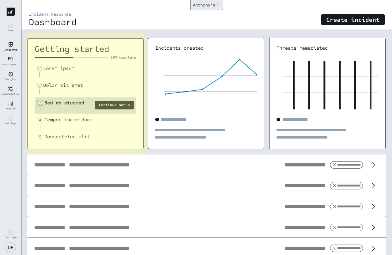
Barracuda Email Protection consists of 3 products, often sold in a bundle. 32% of customers never complete setup for the entire bundle.
Here is an overview of the existing trial setup experience:
🆕
Customer trials Email Protection bundle
🔨
Sets up Product A
💻
Continues to use Product A
🤔
Never realizes that there are 2 other products not set up
What was causing this problem?
To understand the problem, I conducted a user flow analysis of the existing setup experiences. I also interviewed customer success engineers and product managers who directly interacted with customers.
1— Customers do not that know they must set up each product individually
Customers are expecting a cohesive setup experience and there is unclear navigation informing them to set up multiple products.
2— Repeated steps across the products
There are steps asking for the same information across products, making the setup take longer than needed to complete.
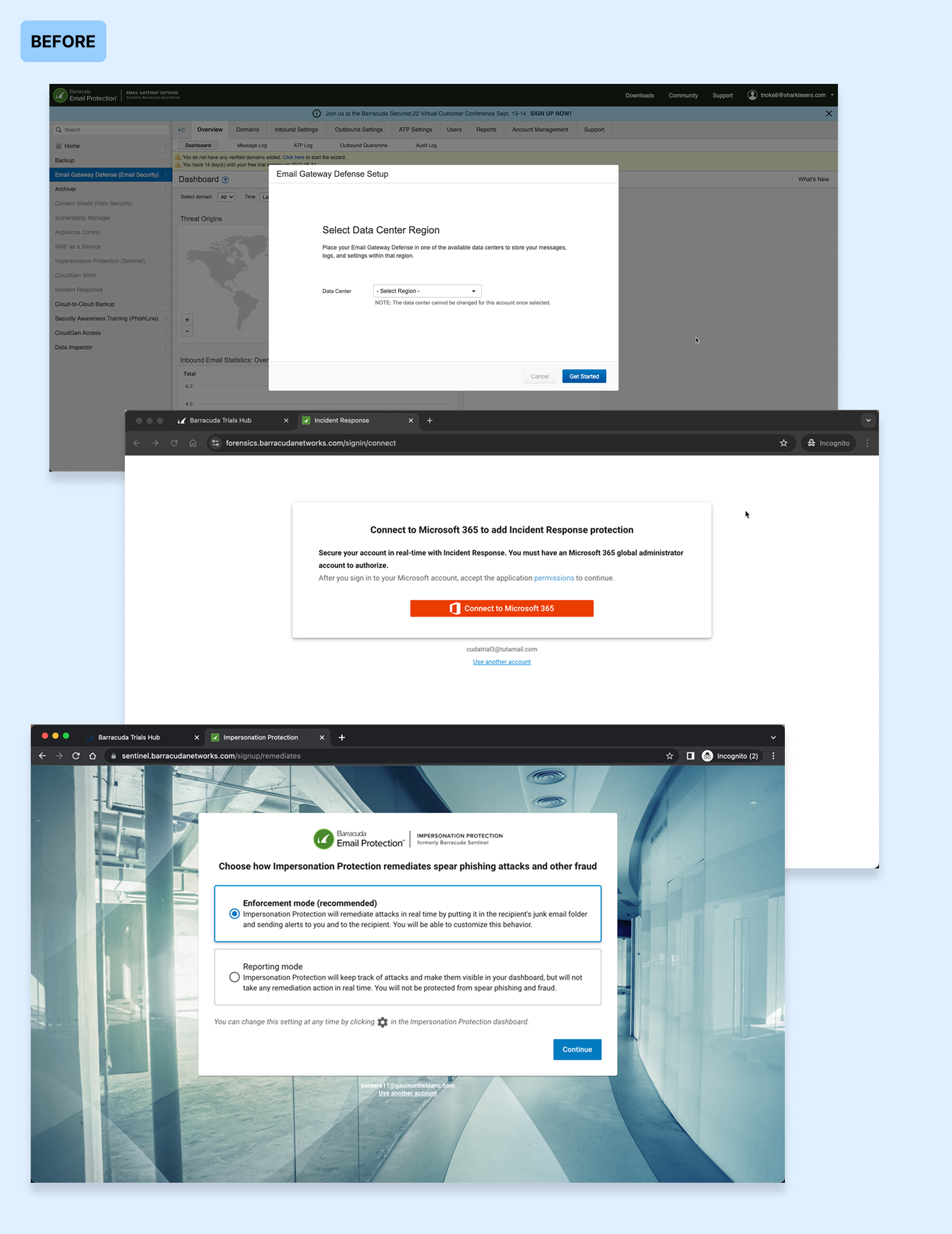
3— Inconsistent UI across the products
Each setup UI uses a different layout and has an inconsistent look and feel. This makes it feel like the products are not part of the same bundle.
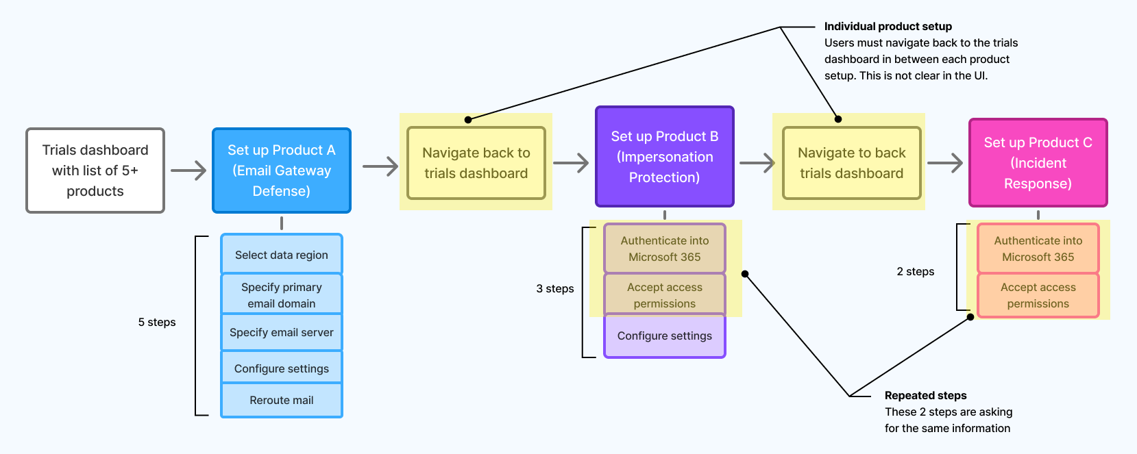
User flow for the original setup experience. Users must navigate back to the trials products to continue setting up the next product(s), and there is no clear direction as part of the flow.
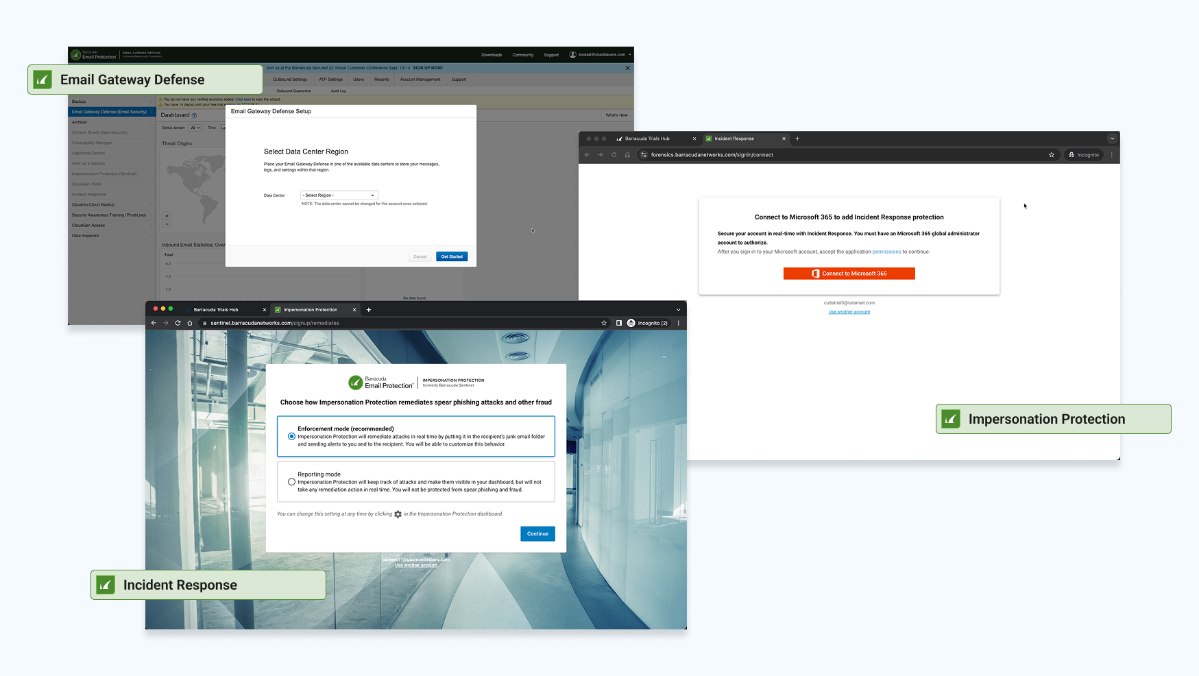
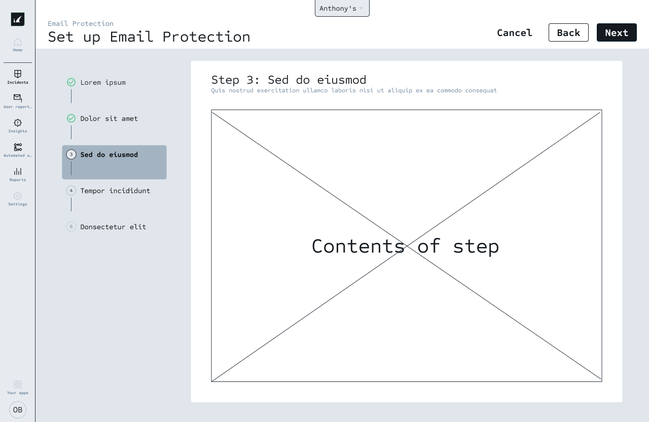
Example of the setup UI for each of the 3 core products. Each has a completely different look and feel.
THE PROCESS—
Quick win— What if we alert customers that there are other products to set up?

This solution was great for notifying existing customers who are set up on all 3 products. Within the first month of launch…
~4000 existing customers received an alert
13% of those customer clicked on CTA to complete setup
75% of those customers followed the through and completed setup
However, this is not the best experience for new customers… Imagine this experience for a new customer:
🤔
I decide to trial Email Protection bundle
🥳
I complete setup for Product A
😡
Now I’m getting alerts that I have more steps before setup is complete
What are some other solutions?
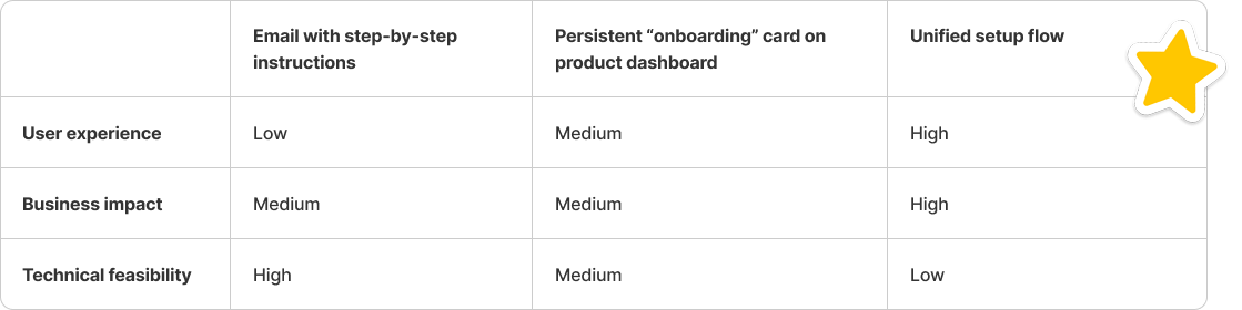
I led a series of workshops with engineering and product management counterparts. The goal was to align on the problem statement and collaboratively generating a diverse range of solutions. Here are a few ideas we explored:
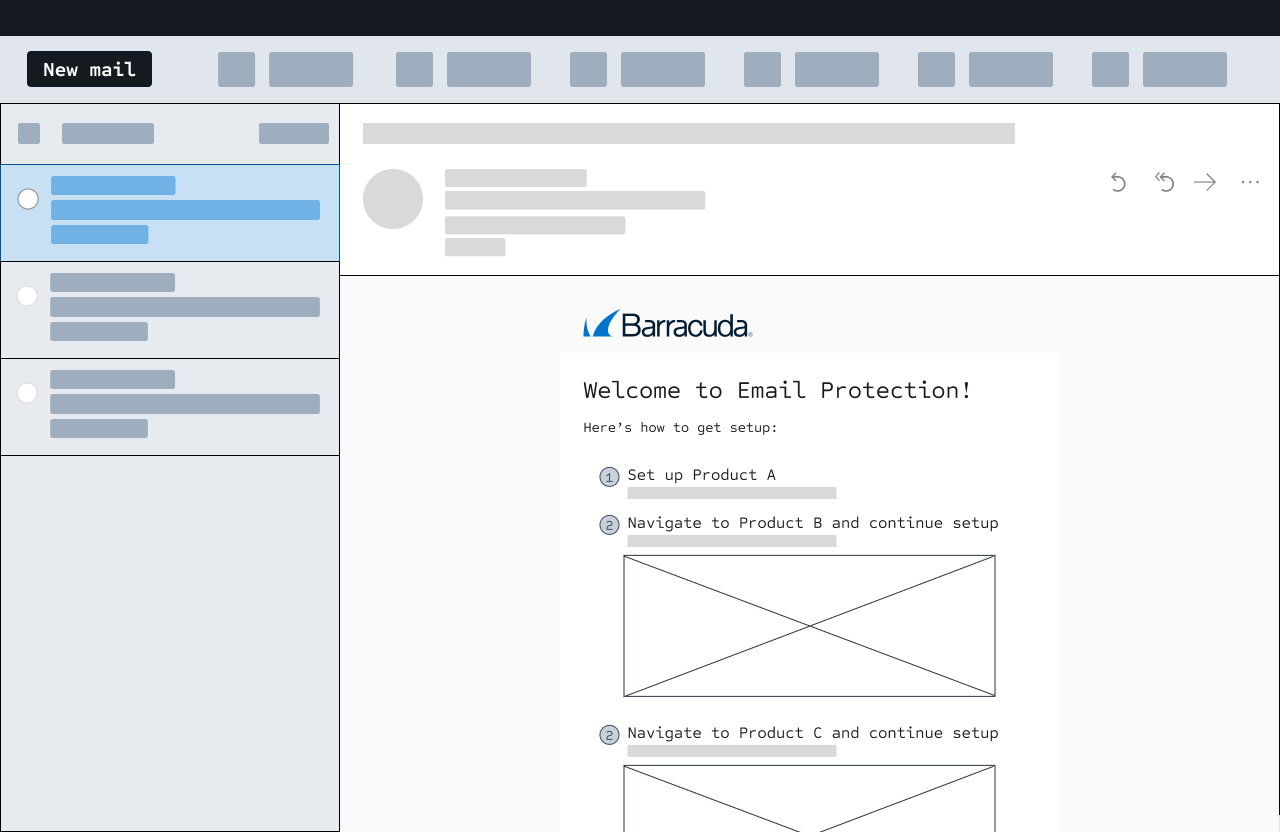
Email with step-by-step instructions for setup
Persistent “onboarding” card on product dashboard
Bring the 3 products into a unified setup flow
To make a decision, I collaborated with engineering and product management to rank the ideas based on usability, business impact, and technical feasibility. With this information, we decided on unified setup flow.
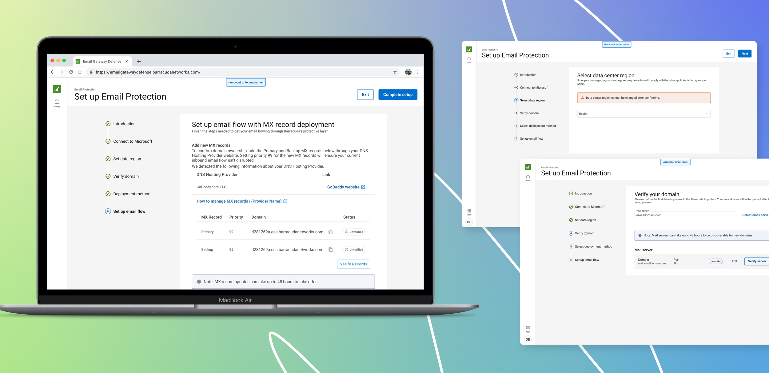
THE SOLUTION
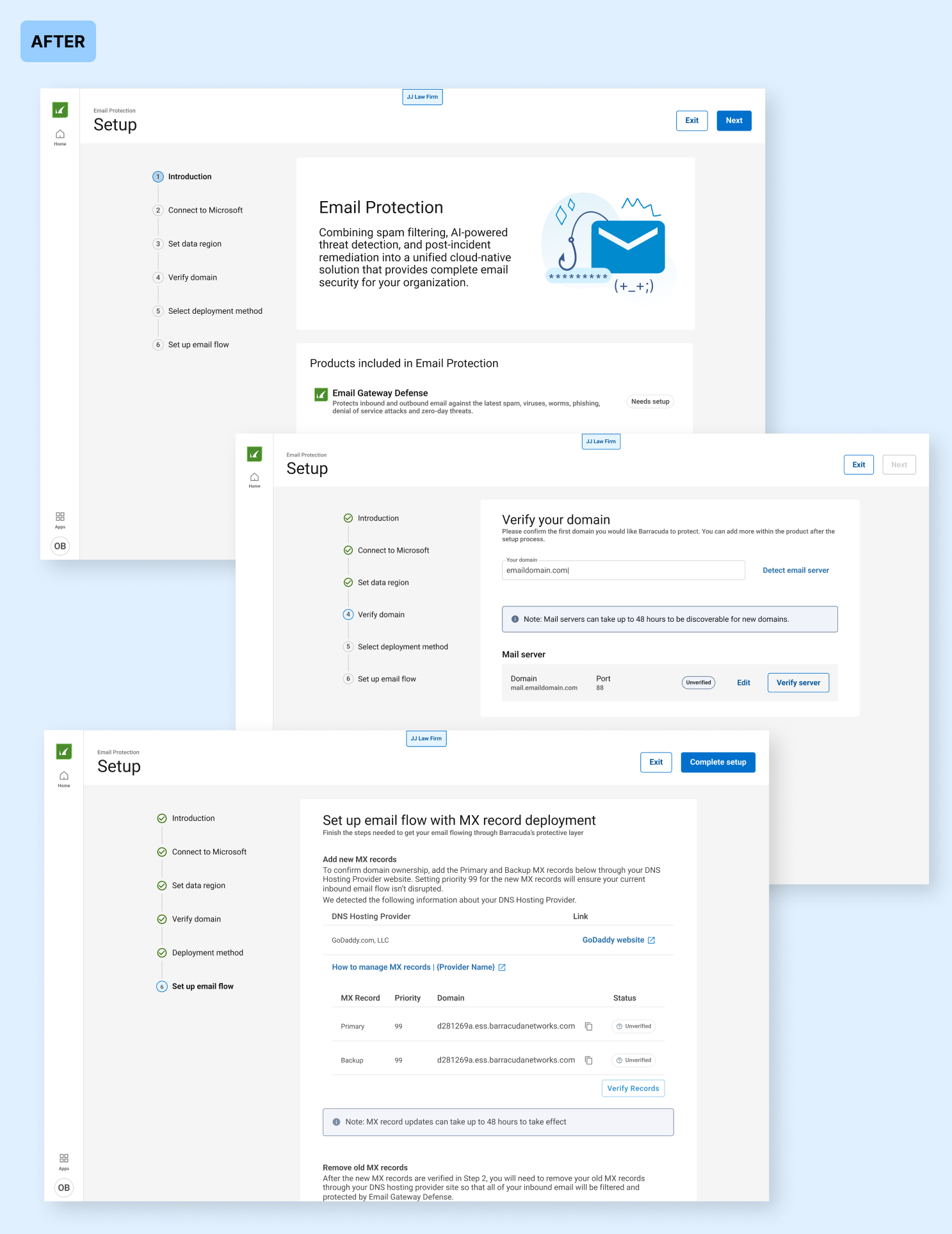
A single setup experience for Email Protection’s core products— 3 separate setup experiences completed in one flow

What changes did we make?
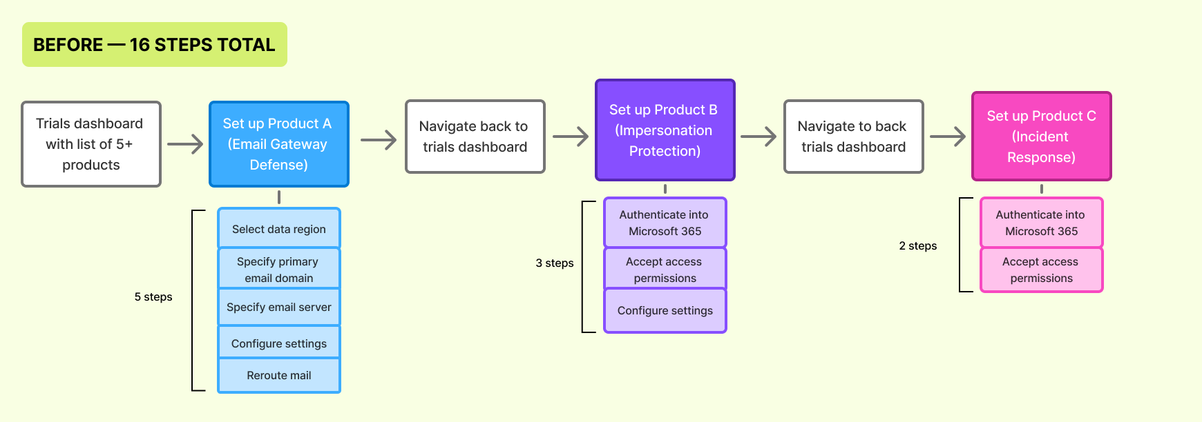
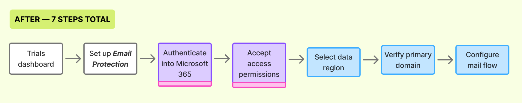
1— Reduced the entire setup experience from 16 steps to 7 steps.
I brainstormed opportunites to simplify the setup experience, which reduced the number of steps without impacting technical requirements
Enabled automatic retrieval of information when possible to eliminate manual entry for certain information. This reduced friction and saved time.
Removing repeated steps. This means that by having been entered once, the information can be reused for other steps.
Removed steps for configuring settings, since we found that 98% of customers start with the same default configurations.
2— Updated UI to optimize for efficiency and consistency
Previously, the setup UI for each of the 3 core products have completely different looking and feel. Now, the entire setup experience uses a consistent UI. Using a consistent pattern helps users learn and predict how the interface works, creating a experience that is easy to follow.
So… how did the design do?
The unified setup experience was rolled out to 100% of new customers on June 2025. Within the first 4 weeks, it was used by ~800 accounts.
4 days → 13 minutes
Average time taken to complete setup for all 3 products in the bundle
(This is a 440% decrease)
34% increase
in customers completing setup for the core bundle within 24 hours
12% increase
in trial-to-paid subscription conversion

GOING ABOVE AND BEYOND—
I used this project as an opportunity to create a multi-product pattern
I led an initiative within the UX team to come up with a common setup layout, which can be used as a repeatable template across Barracuda products. This creates a consistent setup experience across the product portfolio and improves design-to-development efficiency for future projects.
In the early stages, I explored different directions to find the right balance for clarity and hierarchy. Through various critique sessions, we landed the following layout. The goal was to keep the layout simple and focused to reduce cognitive load at each step.

CONCLUSION—
This was great start… What are some next steps?
1— Improve onboarding experience
The larger initiative behind this project is to increase the amount of customers reaching first value within the trial period. Following setup, the next portion of the user journey is onboarding— getting customers to learn and understand the value of the product.
2— Watch usage metrics and iterate
Additionally, I am watching usage and success metrics of the launched setup experience to understand where the design can be improved. Due to time constraints, I was not able to conduct usability testing on the design, so this iterative process is very important.
Reflections
1— Developers are your friends
A large part of this project is understanding the technical aspects of what the user needs to set up and how that information is used by the products. I regularly collaborated with our developers to understand technical constraints and opportunities, ensuring our designs were both simple and technically feasible to build. For instance, I partnered with an engineer to validate the feasibility of a obtaining API permissions for multiple products with a single Microsoft authenication procress, which untimately reduced setup steps.
2— Leverage user flows as a design and communication tool
One lesson I learned during this project was the importance of user flows as a design tool. By visually mapping out the entire setup journey, I was able to gain a holistic understanding of the original setup process, quickly identifying friction points and opportunities for simplification. Moreover, the user flows helped in providing a basis for effective collaboration among all stakeholders throughout the process.