
CASE STUDY
Launching the MVP of a new email security feature that warns users of potential phishing attacks

Barracuda Email Protection is a B2B cybersecurity platform that uses advanced AI and machine learning to scan organizations’ incoming emails and prevent spam, malware, and phishing attempts from reaching users’ inboxes. We protect organizations from email-borne cybersecurity attacks.
I led the design and strategy for a new feature that warns and educates email users of suspicious emails, preventing them from falling for phishing attacks.
OVERVIEW—
Role— UX Designer
Team— 1 Product Manager, 1 FE Engineer, 1 BE Engineer, 1 UX Researcher, 1 UX Designer
Timeline— 4 months
Within 4 months, we launched the beta version of email warning banners, which successfully protected users from phishing attacks and improved competitor win rates in sales.
THE SOLUTION—
4000+
accounts adopted within first month
56%
user satisfaction in beta version
-15%
support tickets related to email efficacy since beta release

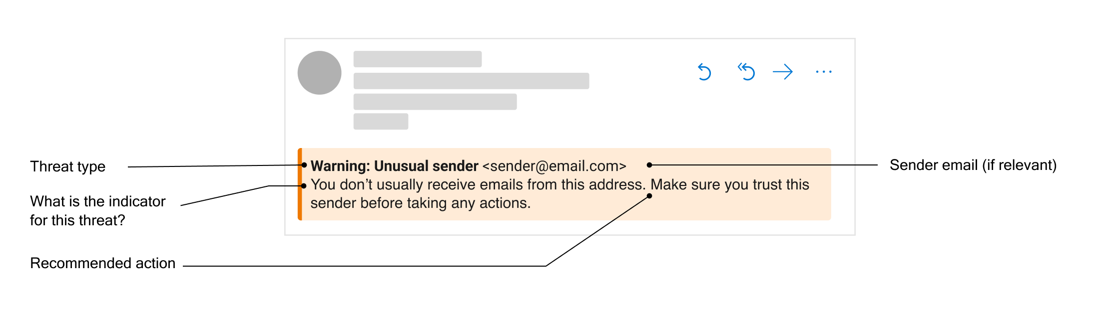
Email warning banners alert users about potential threats in an email. Banners are injected at the top of a an email if potential threats are identified.
Our machine learning threat protection feature is not guaranteed to be 100% accurate. How might we protect email recipients from phishing threats that “fall through the cracks?”
THE PROBLEM—
Barracuda’s Email Protection suite uses machine learning classifiers to detect and protect customers' emails from phishing attacks. However, there are some emails that Barracuda cannot confidently flag and are released to recipients; this results in a lower perception of product efficacy.

There are a number of email threats that Barracuda cannot confidently block. These threats show some qualities of a phishing attack, but are strong enough for our classifiers to be 100% sure. We call these suspicious emails.
If we warn users of these suspicious emails, we can expect them to be more cautious before taking actions on that email, resulting in less phishing attacks.
MY HYPOTHESIS—
Will this help solve the problem?
To test my hypothesis, I worked with our UX researcher to design an unmoderated click test. Our research goal was to determine whether adding a warning to a suspicious email will help users recognize it as a threat.
Based on the research, yes.
Research results showed that
The presence of a warning banner reduced the click-through rate on links in suspicious emails
The presence of a warning banner helped users understand the riskiness of suspicious emails
Generally, users perceived a banner warning them of a potential threat as useful
Keeping the user personas in mind
ITERATIONS —
As an email user in an organization, I am primarily focused on completing everyday tasks that involve email.
As an average email user, I am not knowledgeable about advanced cybersecurity threats.
With the persona in mind, I focused the warning content on providing educational and actionable information for the average email user, who is not as knowledgeable about cyber threats or has the mental capacity to pay attention.
Decisions, decisions
I collaborated with the PM and other designers to arrive at a design based on our collective industry knowledge and information about our users.

Some of my design explorations
I then conducted A/B testing to narrow down a design. The research goal was to find the design and message content that most effectively captures users’ attention and educates them on potential dangers of the email.
Research insights that informed the winning design
Users demonstrated a misunderstanding of common terms such as “domain” and “phishing”, leading me to favor more descriptive messaging.
Though there was no significance, the winning design performed slightly better in user comprehension.
Though there was no significance, the winning design performed slightly better in preventing users from clicking a malicious link
BETA RELEASE—
Testing out the concept in real-world context
To truly understand how effective banners are in influencing user behavior and preventing phishing attacks, I needed to test the banners in real-world contexts. I spearheaded a beta release plan with a feedback mechanism to gather direct customer feedback on how well the banners are working for them. The research goal was to evaluate customer satisfaction and how to further drive feature adoption.
ITERATIONS BASED ON RESEARCH INSIGHTS—
1— Reducing notification fatigue for specific warning types
We received feedback that email banners show up too frequently, most of the time on emails that are obviously safe. Upon investigation, I found that this is caused by a specific warning type: external sender, which injects a banner on top of every external email.
I adjusted to feedback by designing a separate notification method for external senders, which decreased banner fatigue amongst users, further improving the feature adoption rate and user satisfaction.

2— Reducing perception of noisiness
We received feedback that some users perceive the banners to be too noisy. I hypothesized that this is because the banners show too much text.
Though the original idea behind the description is to be educational and actionable, I adjusted to feedback by replacing the description with a “Learn more” link that opens a new page. This method of progressive disclosure makes the banner more concise and allows more space for explanation on a separate page.

More than just a warning banner
NEXT STEPS—
Aside from warning users of suspicious emails, I envision banners to serve other business goals in the future. These are more design challenges I plan on exploring in future releases:
Leveraging banners as a touchpoint for feedback — Our machine learning detection algorithm benefits from more data points. What if users could interact with the banner and report whether the determination was correct or not?
Improving the perception of efficacy for our algorithm — We received feedback that the banners are appearing in emails that are safe, meaning some users still feel that our detection algorithm is not perfect. How might we balance this perception with the reality that our machine-learning algorithm is not perfect?
Further driving feature adoption — How might we encourage more customers to enable this feature?
Fail fast and iterate
This project taught me to make decisions quickly and test my hypotheses along the way. By validating my assumptions with inexpensive remote user testing, I felt more confident to move my decisions forward. By releasing the feature into beta quickly, I discovered where my ideas were not working and I improved based on user feedback.
REFLECTIONS—
Working with a “non-traditional medium”
This project worked with a feature outside of the typical mobile or web app. Because banners were to be inserted into users’ emails as HTML, there was not much flexibility in the design, especially with interactions. I worked with engineers to understand these constraints and I focused on optimizing the content and visual design. This sets an example of how the design process can be applied outside of traditional web or app interfaces.